
This report provides a quick way to see the number of tickets in your account broken down by the assigned agent and the channel the ticket was submitted via. It uses one metric, and two attributes.

What you'll need
Skill level: Easy
Time required: 20 minutes
- Explore Professional
- Editor or Admin permissions
- Ticket and agent data
How to create the report in Explore
Use the following steps to create this report in Explore.
- In Explore, click the query (
 ) icon.
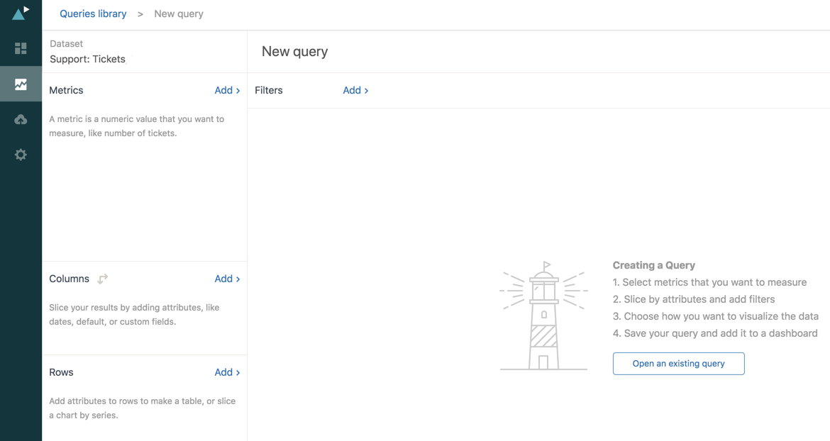
 - In the Queries Library, click New query.
- Now, you need to select a dataset containing the ticket data you'll need to build the query.
Select Support: Tickets.
Query Builder opens.
- Next, you need to add a metric. A metric is the thing you want to measure, in this case, the number of tickets.
In the Metrics section, click Add.
- In the metric list that appears, expand Tickets, click Tickets, and then click Apply.
Notice that COUNT(Tickets) is displayed in the Metrics section, and Explore automatically displays the count of tickets in the main section of the page.

- Next, add the two attributes that will break down the number of tickets by assigned agent, and ticket channel.
In the Columns section, click Add.
- In the attributes list that appears, expand Assignee, click Assignee name, and then click Apply.
- In the Rows section, click Add.
- In the attributes list, expand Ticket, click Ticket channel, and then click Apply.
- You'll now see something like the following chart:

Notice that by holding down CTRL (Windows), or OPTION (Mac) on your keyboard, you can select more than one ticket channel from the Ticket channel axis. Alternatively, click the header (in this case Ticket channel) to select all items.
- By default, Explore chose a column chart to best display the data. However, the original Insights report displayed a bar graph. To change this, click the Visualization type (
 ) icon.
 - From the Visualization type menu, click Bar.

- Explore switches the chart to a bar graph. Assuming you select all ticket channels, you'll end up with something like the following:

- In the original Insights report, the data was stacked so that each agent name has only one bar showing the total number of tickets divided into colors for each channel type.
Click the chart configuration (
 ) icon.
 - Click Chart to open the Chart menu.
- Check the Stacked check box.

- Click the chart configuration icon again to close the menu. Assuming all ticket channels are selected, you'll see something like the following:

- The query was, by default named New query. Click the New query text and replace it with a title of your own.
- Finally, click Save.